Online and mobile giving have been gaining popularity over the past few years, bringing charities a new medium to raise funds and stay closer to potential and existing donors. Partially, this trend has been caused by the digitalisation of payments brought to us by the pandemic; on the other hand, customers have become increasingly tech-savvy, putting their trust in digital payments and opting for more modernised and convenient solutions.
According to a survey conducted by Blackbaud Institute, mobile giving has increased by 42% over the past three years. With that in mind, note that 66% of charities are worried they will miss out on opportunities for digital fundraising. Can you see how these two statistics highlight the importance of a solid digital fundraising strategy for charities?
To secure more funding and build a path to continued support from their donors, non-profit organisations must opt for online fundraising platforms that generate trust within the target audience. This is where the big question comes into play. What generates trust?
At Waytobill, we’ve noticed how much of a game-changer payment platform customisation is. By personalising visual assets, adjusting colours, or embedding the fundraising platform on their websites, charities create a feeling of trust that is crucially important for online donors.
In this blog post, we will take you through nine aspects that can be customised when using the Waytobill fundraising platform so that your NGO can increase its conversion rate even further.
1. Fundraising platform customisation for charities: make your logo visible to generate trust
Your logo is what differentiates you from your competitors. It’s the visual asset that connotates your statement, fosters loyalty, and grabs attention when seen for the first time. Therefore, whenever your charity manages to spark the interest of a potential donor, it’s vital to maintain that spark throughout the campaign. When guiding prospects through the conversion funnel, you want to ensure that you deliver the same level of transparency all the way until the last step of the conversion process, which, in this case, is donating to your charity.
![[EN] Fundraising platform visual - just iMac@1x](https://blog.waytobill.com/hs-fs/hubfs/%5BEN%5D%20Fundraising%20platform%20visual%20-%20just%20iMac@1x.webp?width=601&height=500&name=%5BEN%5D%20Fundraising%20platform%20visual%20-%20just%20iMac@1x.webp)
Ensuring that your logo is visible throughout the donation process is a vital part of increasing conversion rates. It reassures the donor that their money is going to the correct charity and that their payment is secure. Take a look at the above example to see what a Waytobill fundraising platform looks like. Can you see the logo in the left top corner?
2. Add a personalised touch to your charity’s checkout by reinforcing the corporate image
In the previous section, we established that logos are crucial for generating trust. But we can all agree that your corporate image is made up of other vital aspects too. Corporate colours, for instance.
In order to make your fundraising platform integrated with your corporate image, Waytobill allows colour customisation so that the platform can become an integrated part of your brand’s identity. In the previous example, we could see the platform is shades of blue. However, if red is your colour, we can make it happen too!
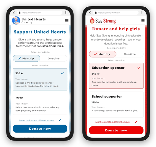
Take another look at the two above examples to see another aspect that can be customised on our fundraising platform. Apart from being able to add your own text explaining the mission of your charity, you can also add the name and description for different donation amounts (which we will cover in the next section).
3. Create various donation amounts to cater to all pockets
The more products you offer, the more customers you’re likely to convert. Similar applies to charities; many people might want to become a donor to your charity but can’t afford to spend more than 10 euros per month, while others might be looking to donate 30 or even 50 euros. This is why offering different packages is such an important aspect.
By opting for the Waytobill fundraising platform, you can offer three different donation options. In the following example, you can clearly see how a cancer research charity has presented three different donation methods explaining what kind of impact each one of them has. This short text has persuasive power, often resulting in prospective donors giving more than they were initially intending to donate, as 81% of donors are likely to increase giving significantly if there’s evidence of the impact of charities’ work. Additionally, there’s the “I want to donate a different amount” option, which allows donors to specify the amount of money they want to donate. By enabling this option, you stand more chances of converting donors looking to donate higher or lower amounts than the ones set by default.
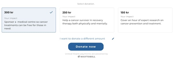
Note, that users can also choose whether they want to become monthly or one-time donors.
4. Embed the fundraising platform on your website and convert website visitors to donors
One way to increase donations online is to make the fundraising platform as visible as possible. Apart from sharing the link on social media and in your newsletter, it’s also important to embed it on your website. By doing so, the platform becomes an integrated part of your web page, gaining visibility but also generating further trust.
All this can be done by using iFrame to insert the fundraising platform on your home page or any site of your choice. Inline Frame allows you to insert the payment solution from Waytobill into your website, giving you full personalisation around it. By using images, texts, videos, colours, and any other branding elements together with the fundraising platform, you build a feeling of trust and convince donors to support your cause.
With the Waytobill payment solution, your donors will choose the amount they want to donate directly on your website. In the next step, they will be directed to the checkout page to finish the donation process.
5. Checkout customisation: show a branded thank you page or onboard donors to establish a strong relationship
Every charity’s ultimate goal is to do good. But to do that they need to collect as much money as possible so that they can continue helping and working on their projects. That is why non-profits need continuous support from donors. But what can you do to turn one-time donors into monthly supporters or convince monthly donors not to cancel their target debits?
It’s highly important to show how much you value each donation and how much of a difference it makes. Apart from generating a feeling of trust, you will also tap into customer loyalty, making the user feel like they’re part of something important. One way to do this is to present a branded thank you page that each donor sees after completing their donation
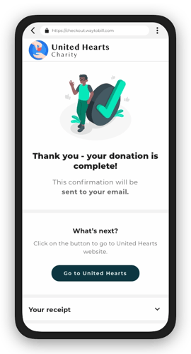
You can use a button that will redirect your donor to your thank you page, once the donation has been completed. Send your new donors to a page where they can see all the projects you’ve been working on, what you’ve already achieved, and how each donation helps your mission.
The thank you page can be also used for donor onboarding, which is an important aspect for many charities. Redirect donors to a space where they can create an account, access special perks like discounts from partners, or opt in for email communications.
6. Customise the content of your text messages with your brand’s name and personalised copy
Did you know that the Waytobill checkout works for online and field sales, as well as telesales? Telemarketers often talk to prospective donors who are really interested in donating to charities but time-consuming registration sometimes puts them off the whole process. When using Waytobill as your telesales checkout, you can send an SMS with a link to the checkout page directly to your donor’s mobile phone. They can then click on the link to open your checkout page, pre-filled with their personal details so that the donation process becomes easier and faster.
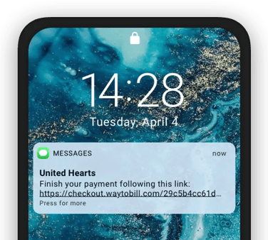
In order to generate further trust and therefore increase donations to your charity, you get to fully customise the content of the text messages sent to your prospects. Decide what the name of the sender is (the charity name is the most popular choice) and use a convincing text message to build trust with your donors. Often, a simple SMS like the one shown above is the best way to bring donations to a close.
7. Customise confirmation emails so that donors can find information about their donations easily
Don’t we all head to our inbox after placing an online order? Seeing a confirmation email is a way of knowing that our transaction has been completed. The same applies to donations!
Apart from displaying a confirmation page after the transaction has gone through, the Waytobill checkout sends out a confirmation email with the donation summary. It includes the charity’s logo and name, donation amount, and clearance date, as well as the transaction ID.
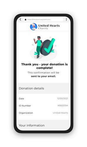
This email becomes especially handy when donors want to review the donation details so that they don’t have to contact the charity.
8. Make your charity’s name visible on bank statements for further transparency
Have you ever opened your mobile banking app and seen a payment you didn’t recognise at first? Then, after a few minutes of thinking, you figured out what it was. This is why it’s so important to avoid this kind of situation and display the name of your charity on bank statements so that donors can easily identify the payments.
Building trust with Waytobill payments continues even after the checkout is completed. With Waytobill, you can easily display the name of your charity on your donor’s online banking. In the following example, you can see a notification about a new Autogiro withdrawal. Note, how it clearly specifies the amount and name of the merchant.
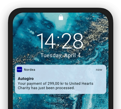
By applying this solution, you reduce the risk of donors cancelling their donations.
9. Desktop and mobile-friendly design for a better user experience
We hope that you can see the importance of customisation options for fundraising platforms and checkouts. But there’s one thing we haven’t mentioned yet!
The Waytobill checkout’s design is fully responsive and therefore desktop and mobile-friendly. This is an aspect that has a direct impact on conversion and customer satisfaction as navigating on a website that isn’t adapted to mobile devices on a smartphone is offputting and not very trustworthy. This is why opting for a responsive design, like Waytobill’s, is a great and responsible choice for any non-profit organisation.
How do you like this article? Can you see how checkout customisation can help you increase donations and convert more donors for your charity? Don’t worry if you have questions that haven’t been answered; contact us and we’ll be more than happy to help, assist, and advise!
